Dashboard
View overall email performance and analytics in one place.
The Email Dashboard gives you a quick overview of your email performance. You can monitor delivery, engagement, and performance metrics in one place. Each section provides real-time, actionable insights.
Best Practices
- Check your dashboard daily to check deliverability issues early.
- Use domain-level data to troubleshoot inboxing and optimize sender reputation.
- Identify best send times based on the Time to Engage report.
Example
An online fashion store launches a flash sale email campaign to 300,000 subscribers.
Minutes after sending, you open the Email API Dashboard:
- The Latency Report shows most emails are delivered in under 5 seconds. This means your customers get the sale notification instantly.
- The Inbox Placement report reveals Gmail inboxing is strong, but Yahoo shows lower placement. You flag it to the deliverability team to improve domain reputation.
- Next, you review the Performance Trend and notice high drops on Day 1. You remove inactive users and resend, which improves deliveries the next day.
- The Distribution Over Time chart confirms Sunday mornings get the highest open rates. This helps you identify your preferred send window.
- The Time to Engage report shows most opens happen within an hour of delivery. You schedule a “last chance” reminder four hours later, which drives additional clicks.
- Finally, the Recipient Domain Distribution chart shows Gmail drives most clicks, so you run a special Gmail-targeted campaign for better results.
By using these insights, the fashion store's campaigns get higher inbox placement, better engagement, and a boost in sales conversions.
Click on the SETTINGS icon to customize your dashboard view.
- Drag and drop report cards to rearrange them.
- Check or uncheck the boxes to hide reports you don’t need.
- Once set, your customized view appears every time you open the dashboard.
Note
Only summar of the reports is available on the Email dashbard screen. Click Analyze → for detailed view.
Read on to know in brief about the different report types available on this dashboard.
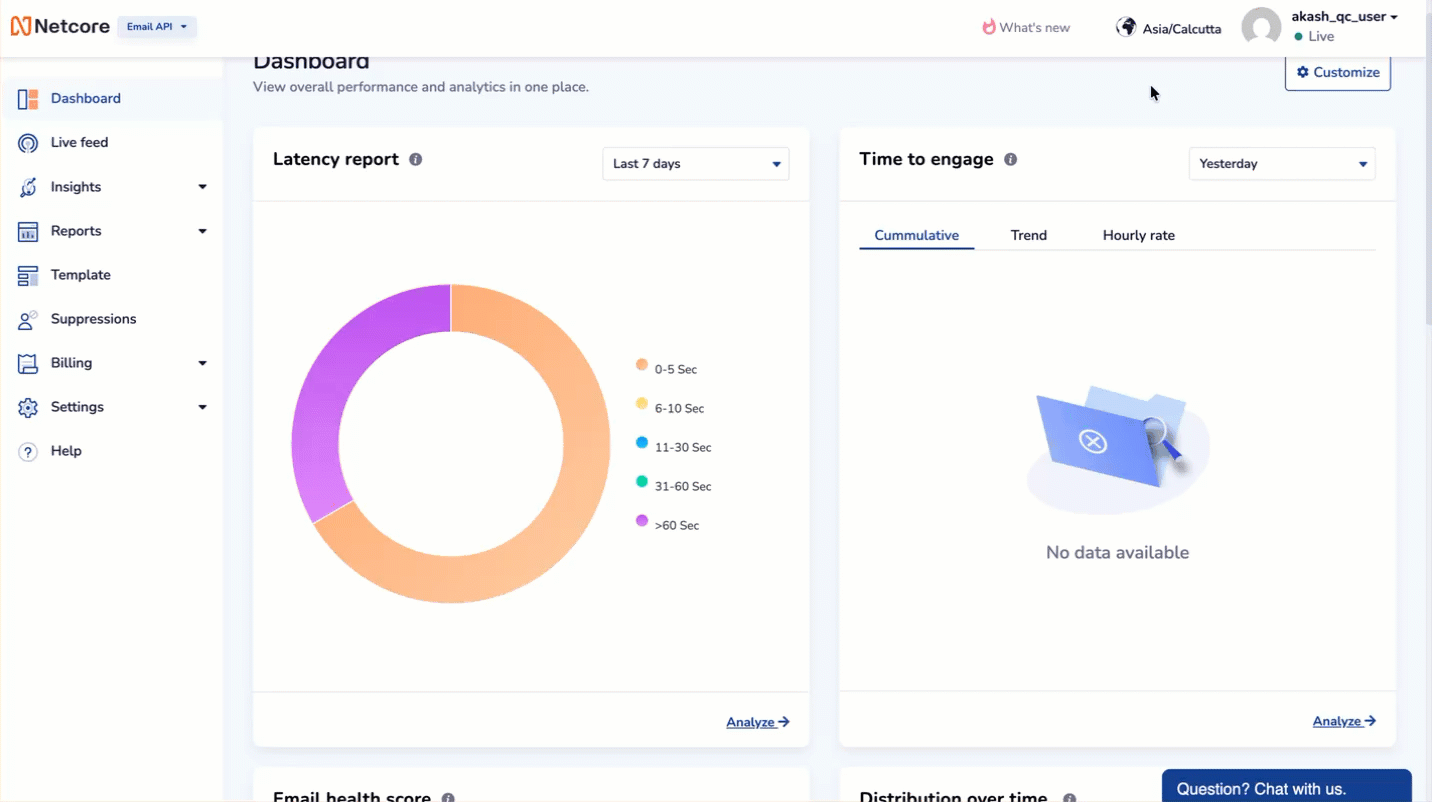
Latency Report
View how quickly your emails reach the recipient's mailbox.
- Displays the time taken from receiving the request to delivering it to the ISP.
- View data in different time ranges, such as last 7 days.
- Quickly identify if there are delivery delays.
- The chart groups delivery times into ranges: 0–5s, 6–10s, 11–30s, 31–60s, >60s.
Analyze the time taken for emails to reach to the recipients
How to Use:
- Hover over each segment to see the exact number of requests in that range.
- Use the date filter (top right corner) to switch between last 7 days, 30 days, etc.
- If most emails are delayed (>30s), investigate deliverability or ISP throttling issues.
Inbox Placement
Check where your emails land.
- Shows the inbox placement ratio for all delivered emails.
- Breaks down data by mailbox provider (Gmail, Outlook, Yahoo, etc.).
- Helps monitor deliverability and identify inboxing issues.
How to Use:
- Identify mailbox providers where inboxing is low.
- Use this data to improve email reputation or authenticate domains (SPF, DKIM, DMARC).
Performance Trend
View performance insight of total email requests for all domains.
- Displays key metrics like requests, delivered, bounces, drops, opens, and clicks.
- Provides a day-wise trend for better visibility.
- Quickly identify spikes or drops in performance.
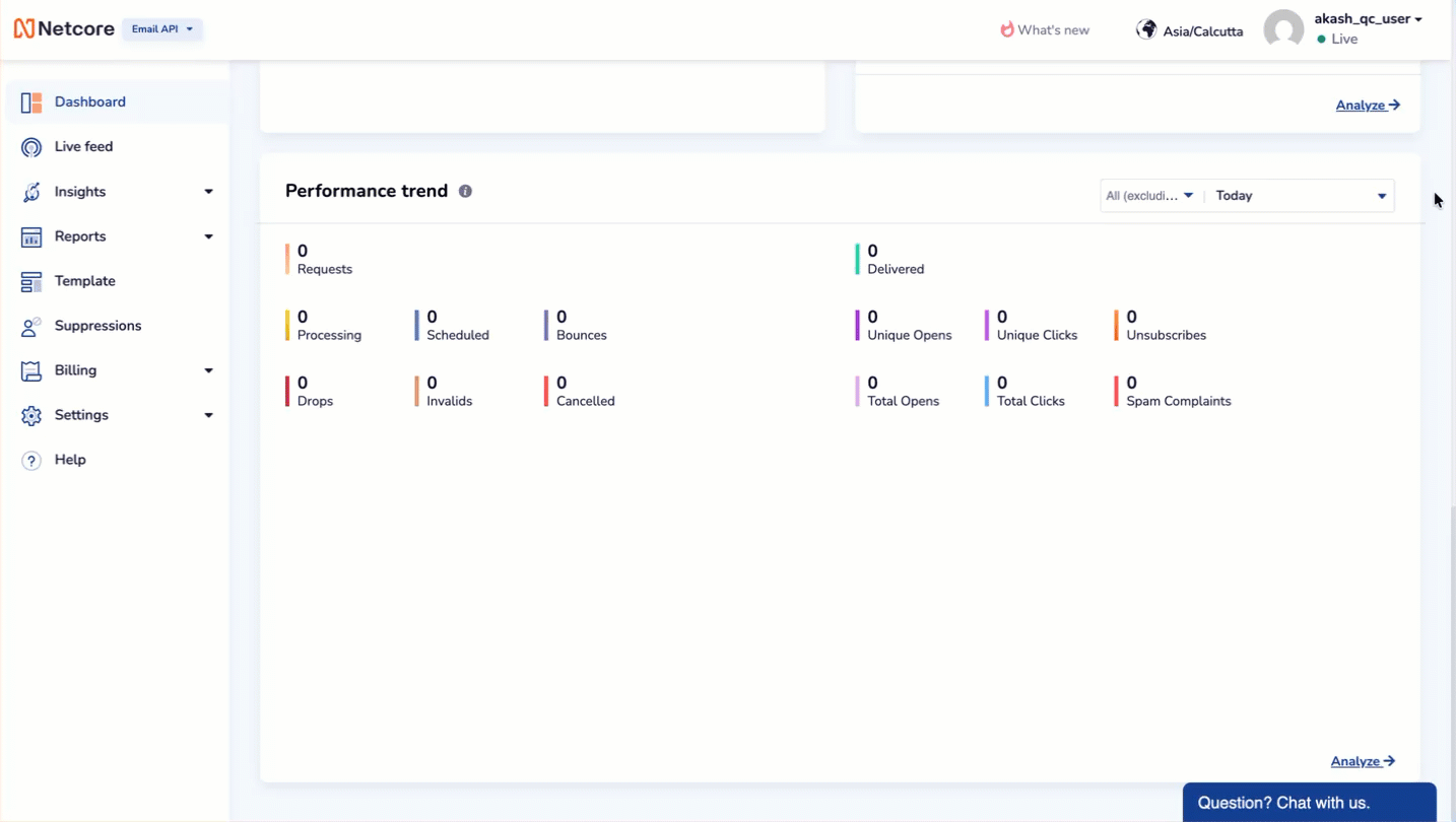
Track your overall email performance over time.
How to Use:
- Look for spikes in bounces or drops to catch issues early.
- Track engagement by comparing opens and clicks over multiple days.
- Click Analyze → for a detailed breakdown by campaign or template.
Distribution Over Time
View date-wise distribution of emails and key metrics.
- Shows daily counts of requests, delivered, invalid, and dropped emails.
- Compares metrics side by side for easy analysis.
- Helps spot unusual trends on specific dates.
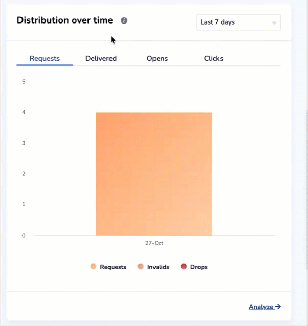
Understand your email flow by day.
How to Use:
- Compare volumes across different days.
- Identify which days saw the most drops or invalids.
- Helpful for spotting sending patterns (for example, if certain days have better delivery rates)
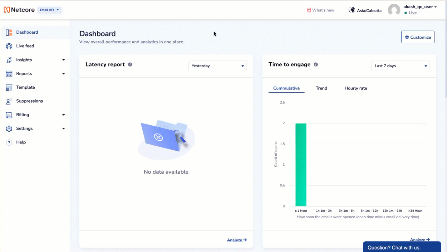
Time to Engage
Measure how fast recipients open your emails.
- Shows the time taken between delivery and open.
- Breaks down opens by hourly ranges (≤1 hour, 1–3 hours, 3–6 hours, etc.).
- Helps optimize send times for faster engagement.
View your email opens with hourly distribution
How to Use:
- Identify the peak engagement window (most users open within 1 hour).
- Use this insight to optimize future send times for maximum opens.
Recipient Domain Distribution
Analyze performance by recipient domain.
- Shows which recipient domains get the most requests (e.g.,
netcore.co.in,gmail.com). - Compares delivery, open, and click metrics per domain.
- Helps troubleshoot domain-specific issues.
How to Use:
- See which domains form the bulk of your sending traffic.
- Spot domain-specific issues (e.g., if one domain shows high bounce rate).
- Click Analyze → to view opens, clicks, and delivery data by domain.